

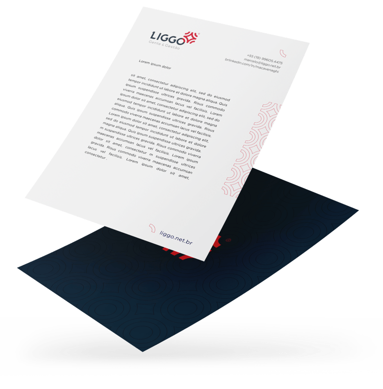
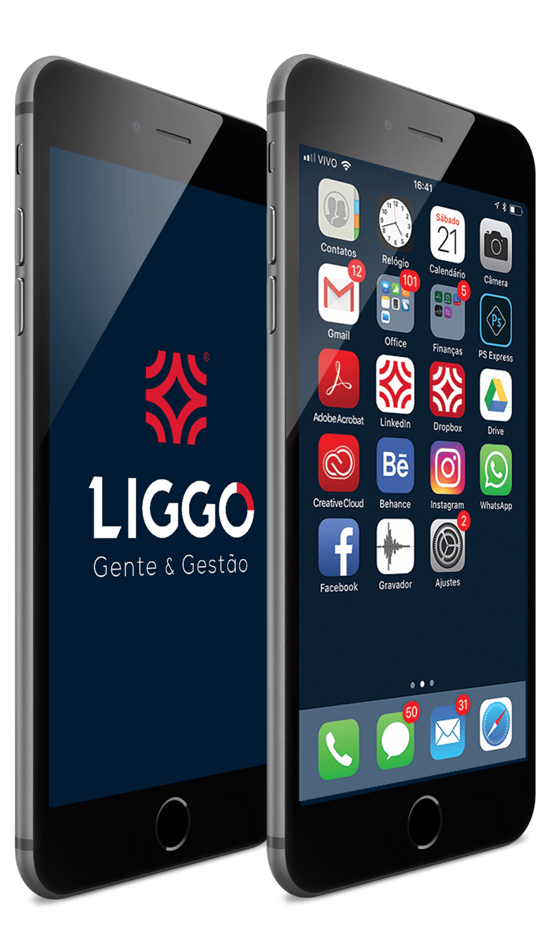
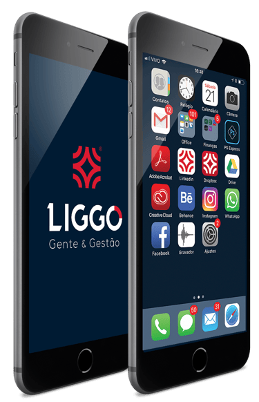
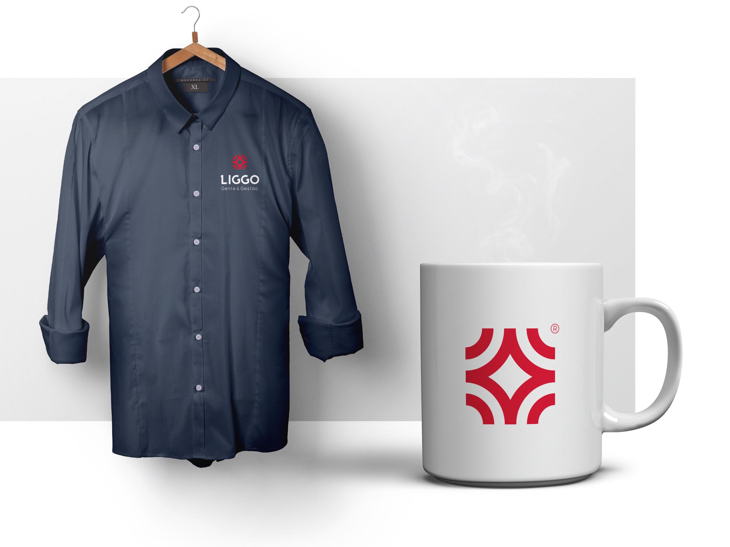
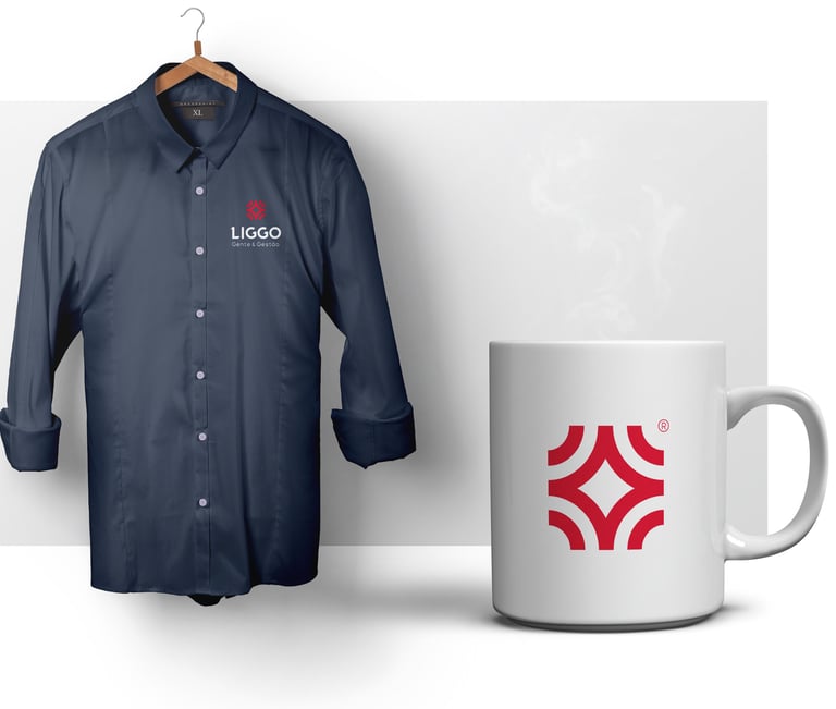
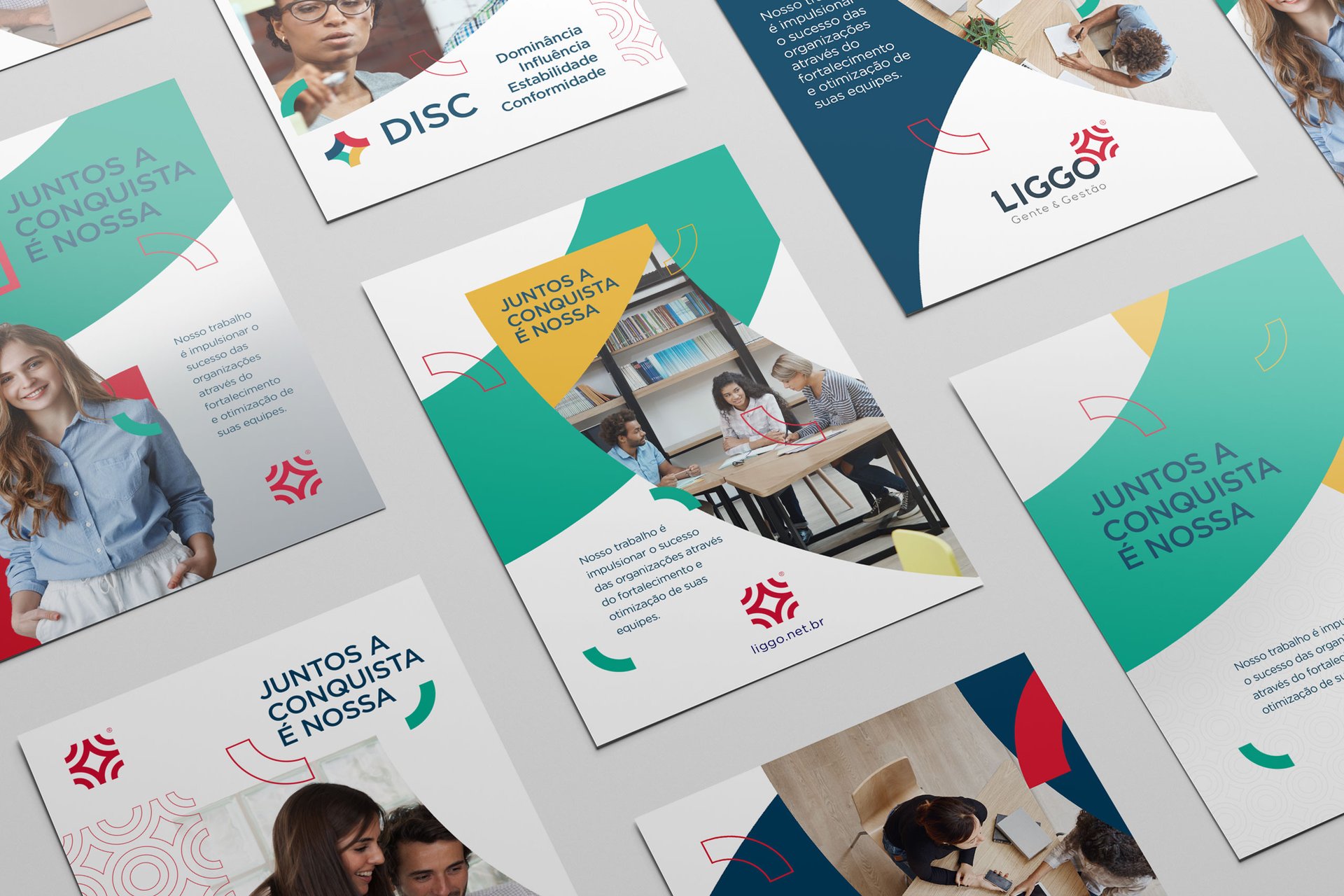
LIGGO®
The project aimed to develop the concept and logo for a consulting firm specializing in the development of strategies for the systematic organization of departmental and individual goals.
Art Direction Beto Gozzo

Inspiration
The design was inspired by conceptual and graphic references from Scandinavian design schools, exploring the simplicity and clarity of geometric shapes and colors.
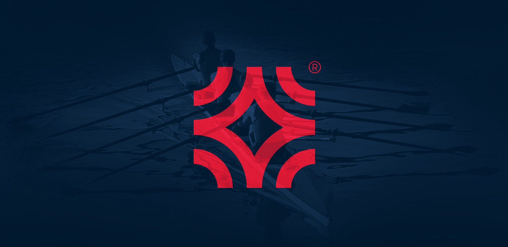
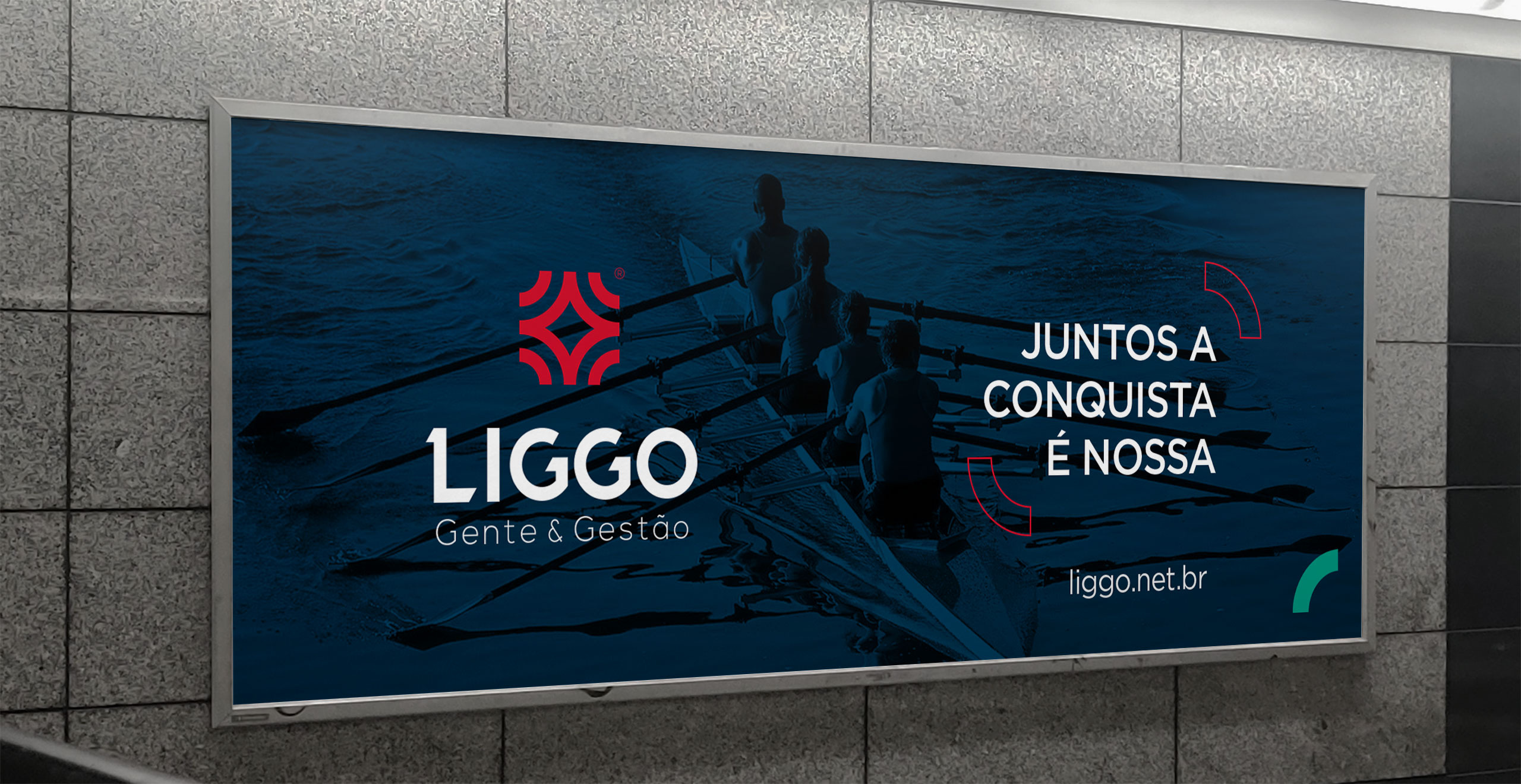
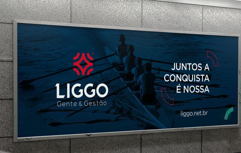
The concept takes its cue from the water sport of rowing, which embodies the same positive characteristics embraced by the company.
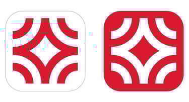
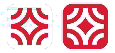
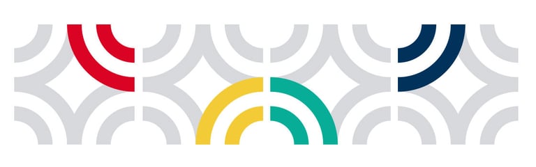
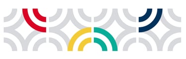
The shapes shown here symbolize OBJECTIVE and CONNECTION.
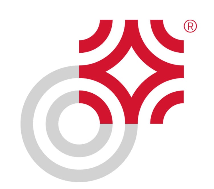
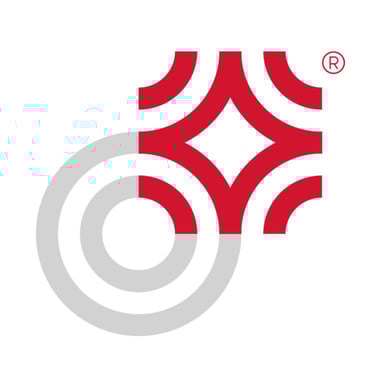
A key conceptual element is the connection between one of these elements and the letter “O,” which signifies the meaning of the word ‘Liggo’ in Esperanto: “Connect.”
The concept instantly conveys the messages that matter most to the company and, above all, to its customers: objectivity, speed, and connectivity.
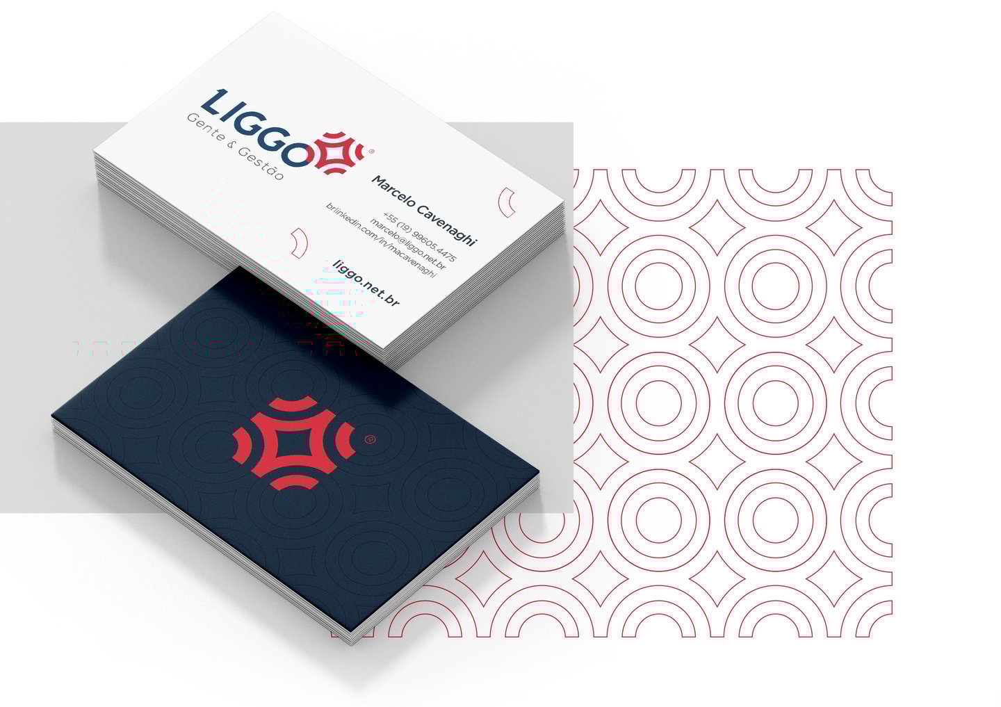
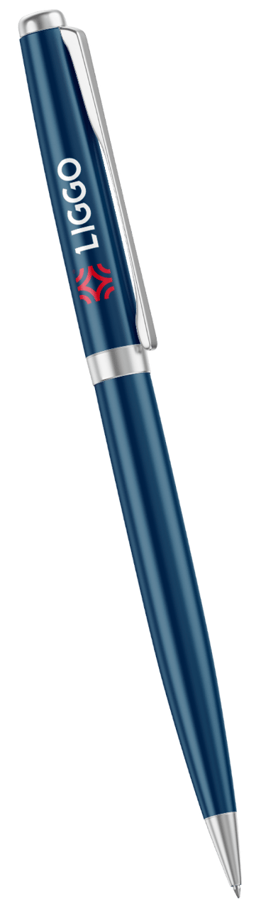
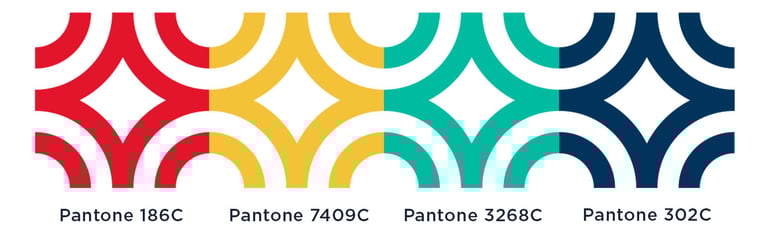
The brand concept stands out for its BLUE and RED colors, which reflect Trust, High Quality, High Technology, and Speed.


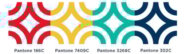
Cores DISC
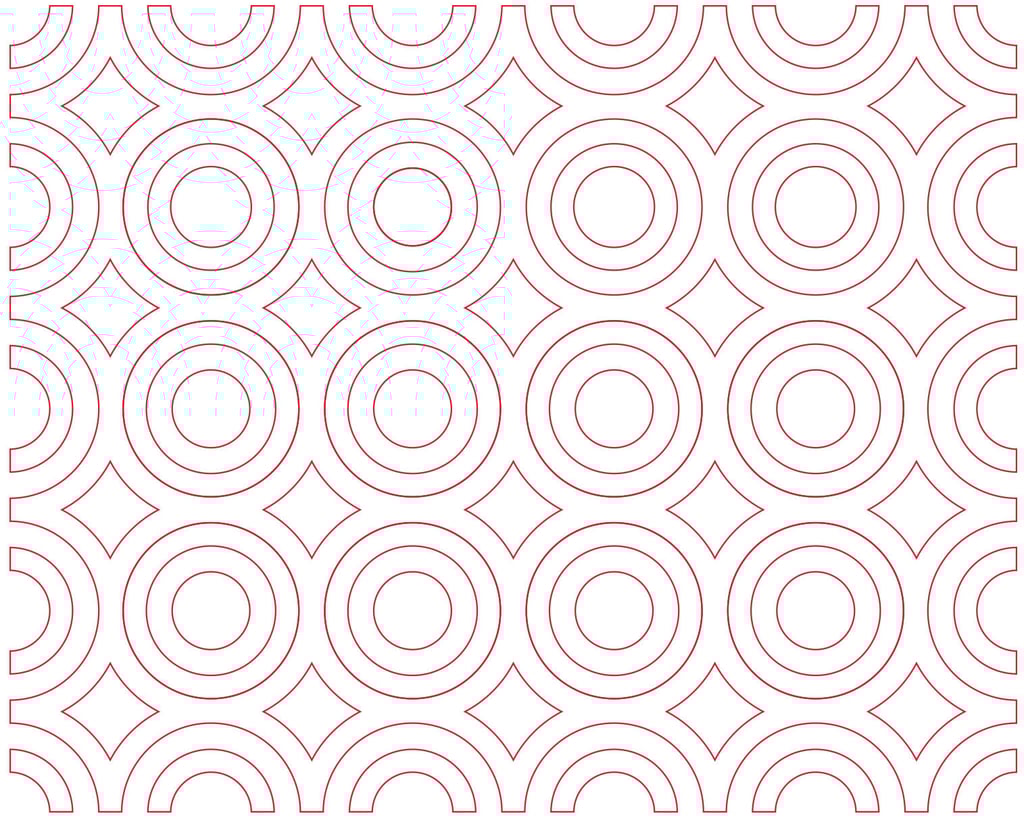
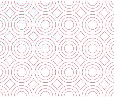
Another cornerstone of the design is the DISC concept, which is used in the company’s work methodology and incorporates two additional color shades. The synergy achieved through the geometric harmony of the four elements lends the concept a linear structure that branches out into various applications and graphic patterns.
A shade of blue used in design elements to make them stand out when placed against backgrounds in Pantone 302 C, and to create a sense of movement when combined with other colors.


Veja também os cases
G10cont®
LYS Clínica Médica®
PE - Sá Cavalcante®


SP Market®