


G10® CONT
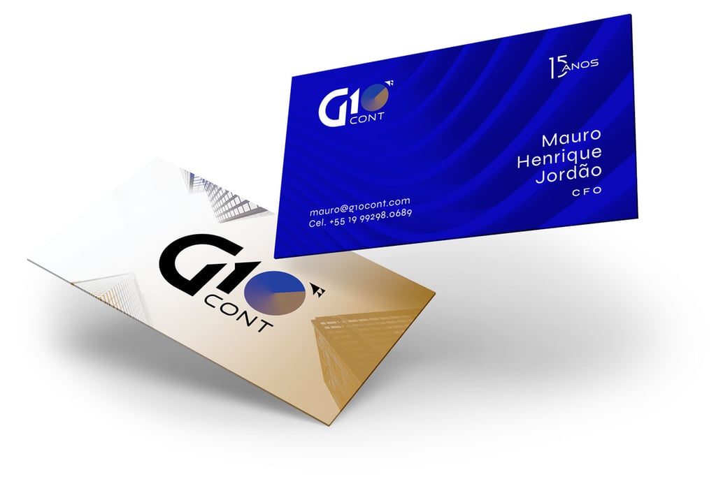
The new visual identity is versatile and adaptable, capable of effectively communicating the wide range of financial and accounting solutions offered by the company.
Art Direction Beto Gozzo


Predict the future by creating it.


This rebranding aims not only to reflect the ongoing digital transformation, but also to position the brand as a modern and trusted leader in the industry.
By adopting a fresh, contemporary look, the G10CONT® brand seeks to convey not only confidence, but also an innovative and dynamic spirit.


Soluções personalizadas de gestão financeira.


Autonomia operacional e consultiva.


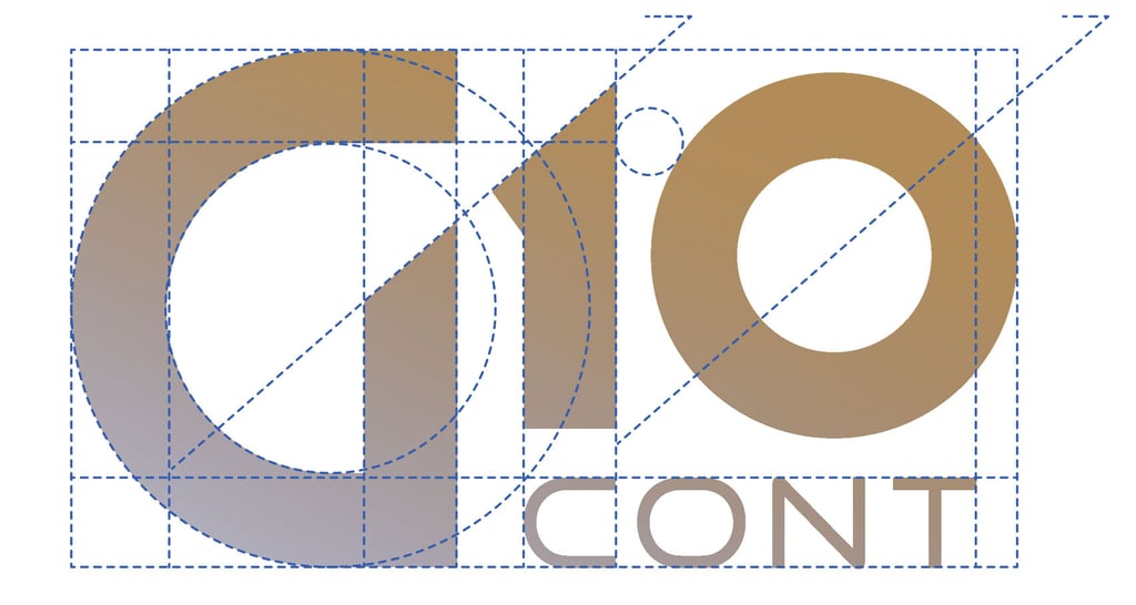
DOURADO: Representa a excelência e o valor que entregamos a cada cliente. Reflete nossa dedicação em fornecer serviços contábeis de qualidade superior.
CORES
AZUL: Simboliza a confiança e a estabilidade. Mostra que somos uma base sólida para seus desafios financeiros.


GESTÃO (CORE)


QUALIDADE
EXPERTISE


Veja também os cases


AHO®
ATMO®
BetterMe®
BSN®