
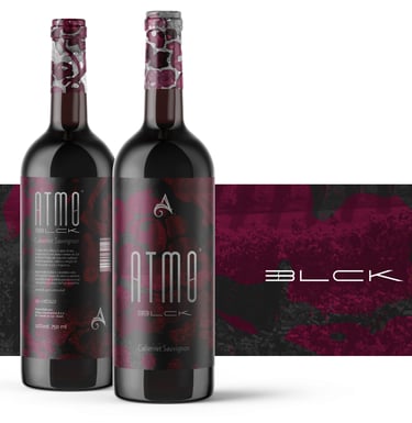
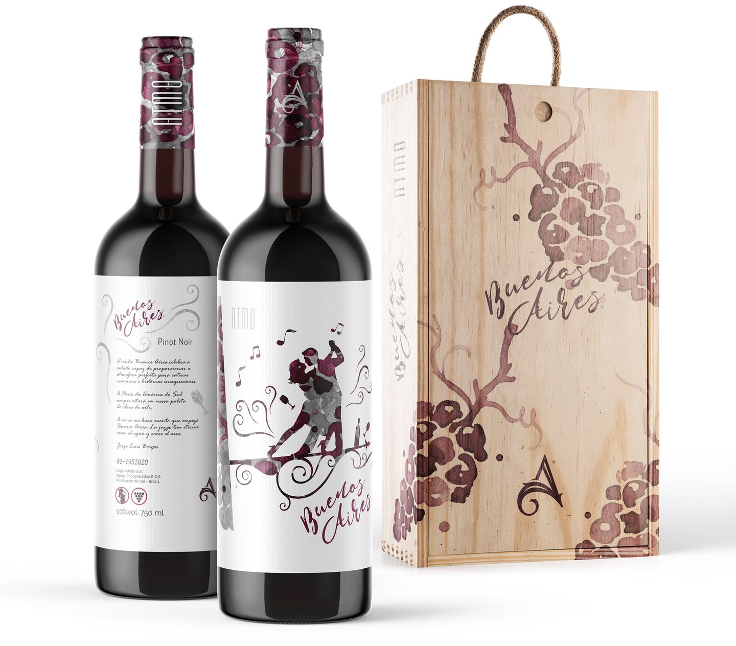
Atmo®
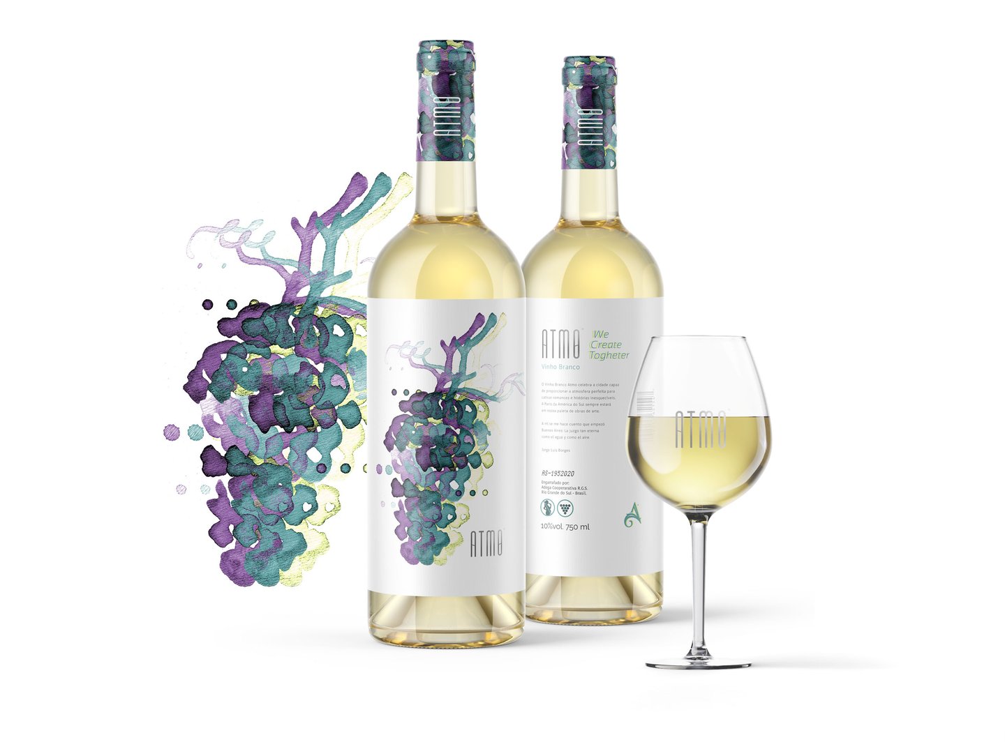
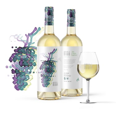
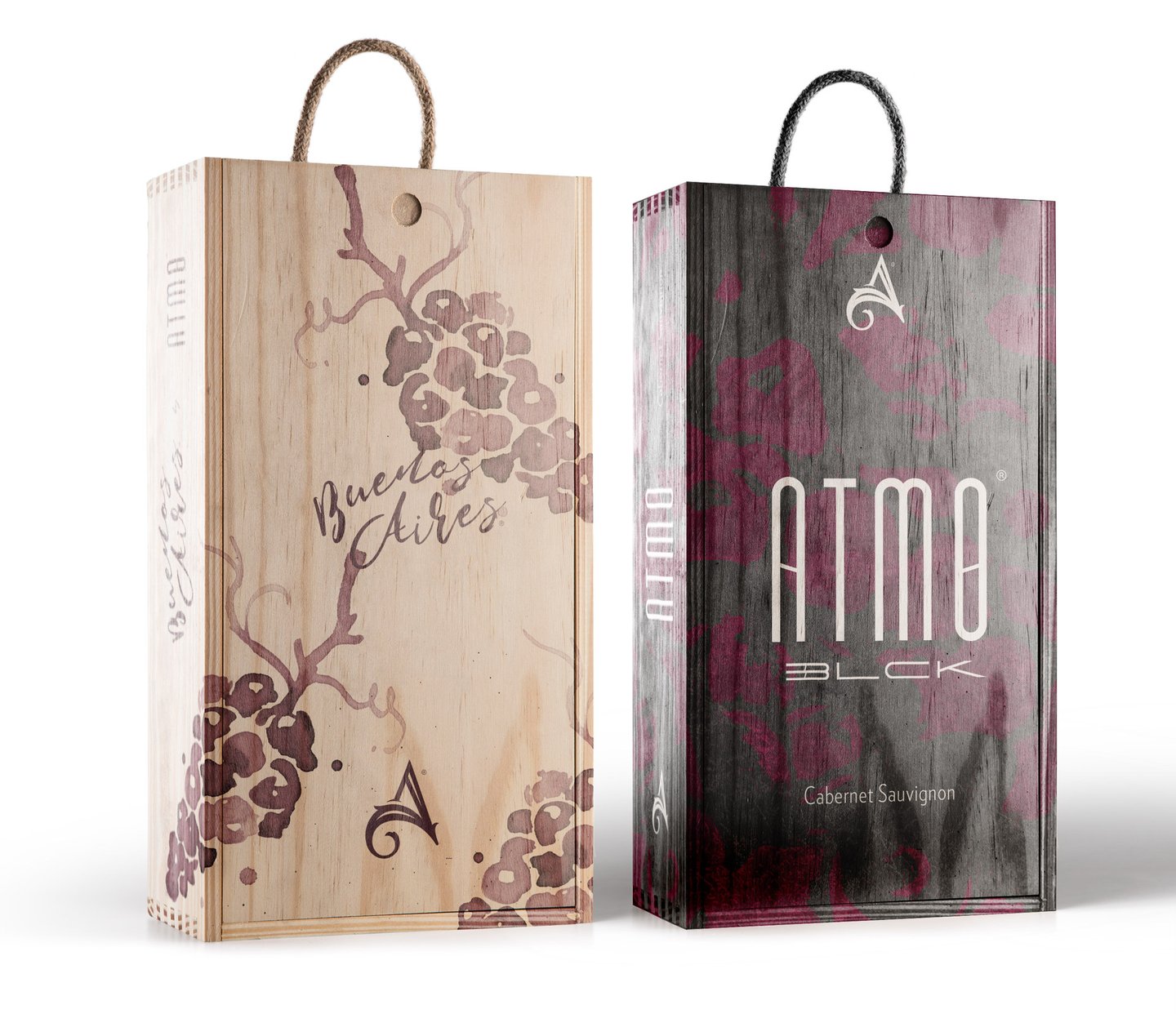
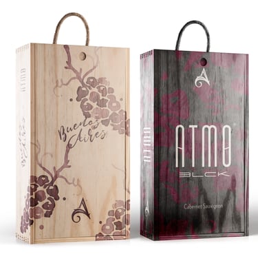
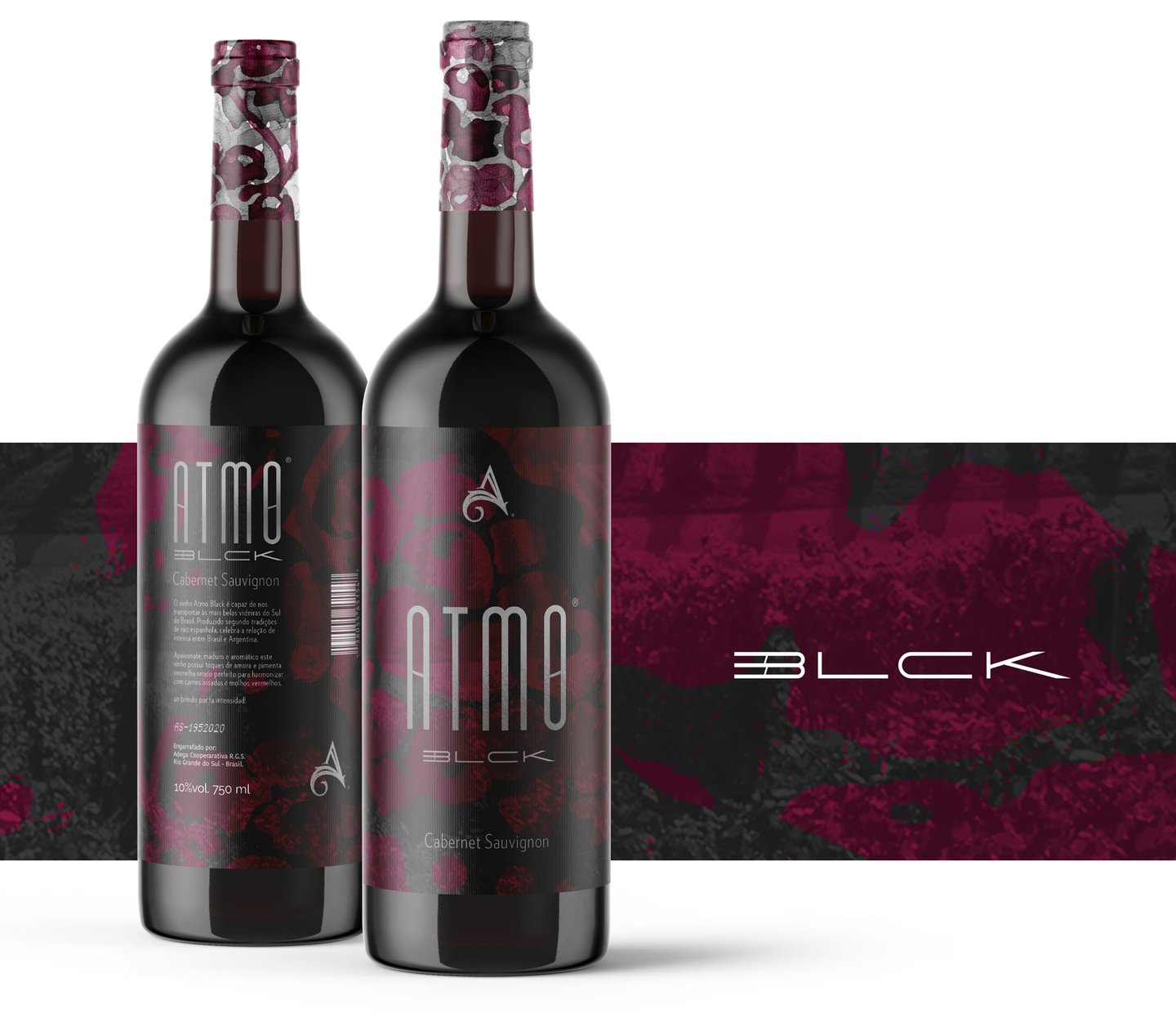
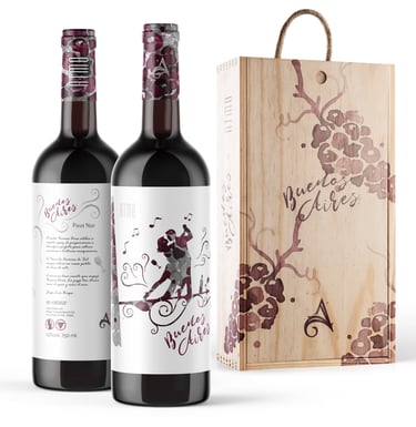
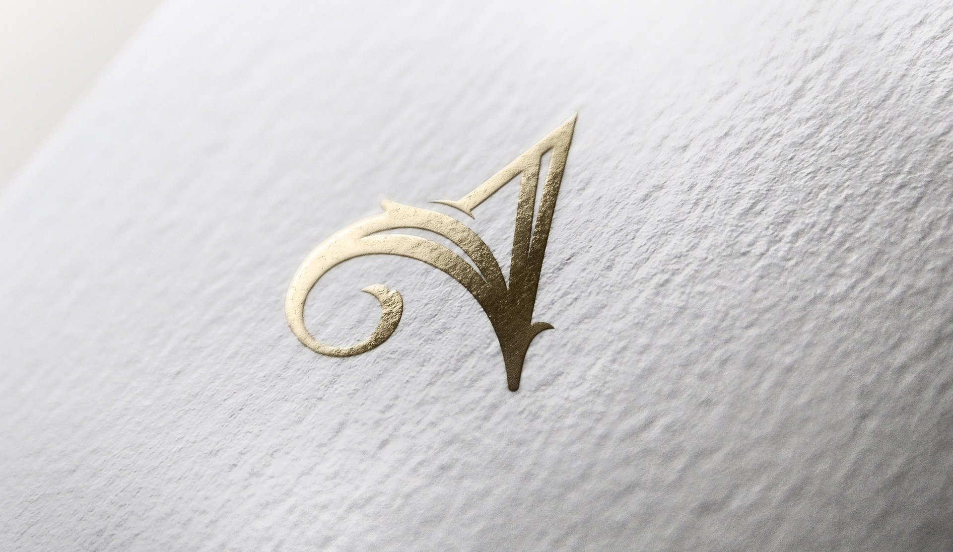
The concept developed for the brand explores the atmosphere created by the consumption of an excellent wine. The symbol is a harmonious fusion of the organic shape reminiscent of a vine leaf and the outline of a grape. It symbolizes the beginning of the journey, where nature plays its vital role in creating the heavenly nectar.
The ascending path of straight lines in the symbol symbolizes the careful application of refined technique from grape cultivation to the winemaking process. Each line represents a stage, a step of refinement and dedication to the art of wine.
Direção de Arte Beto Gozzo
Ilustrações Beto Gozzo
Art Direction Beto Gozzo

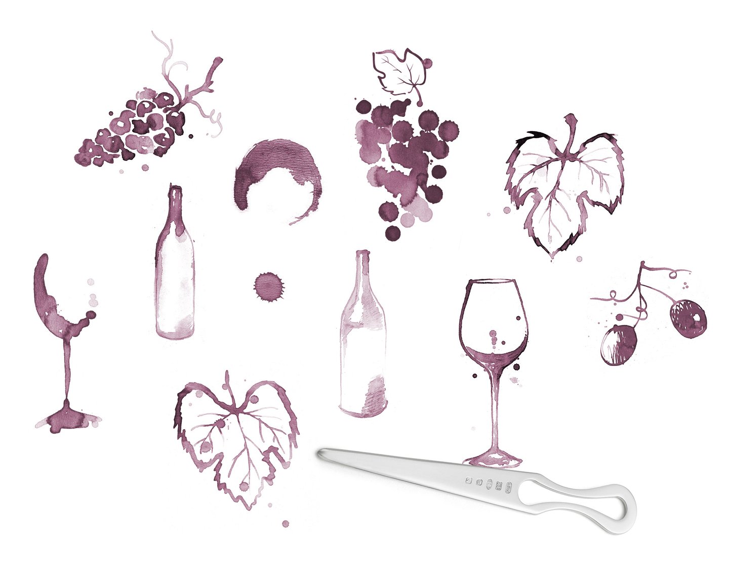
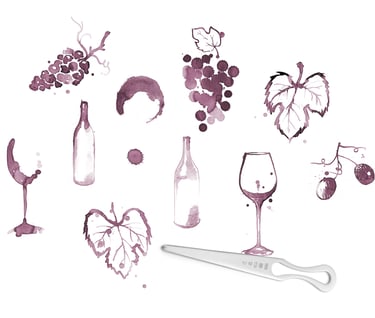
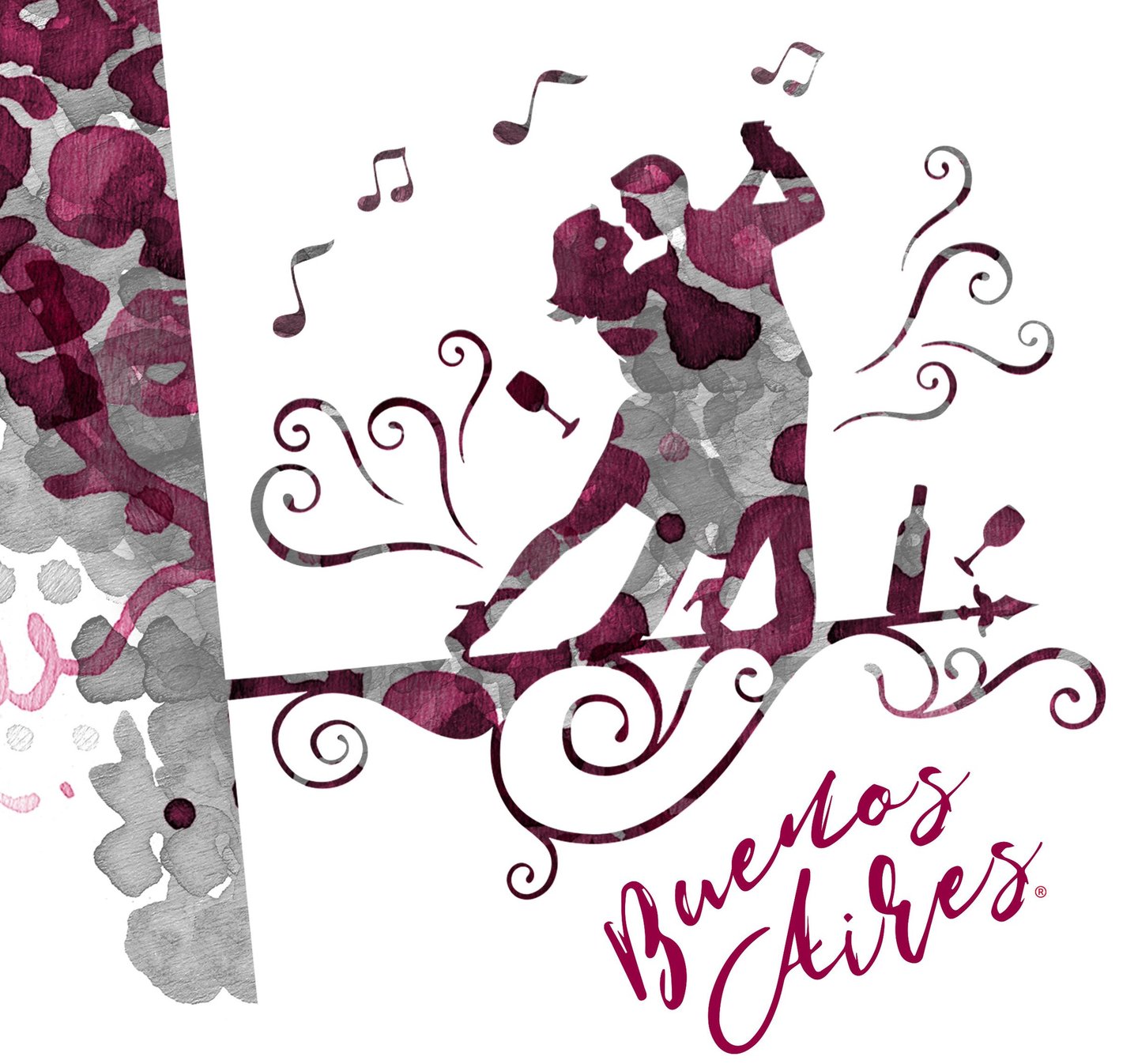
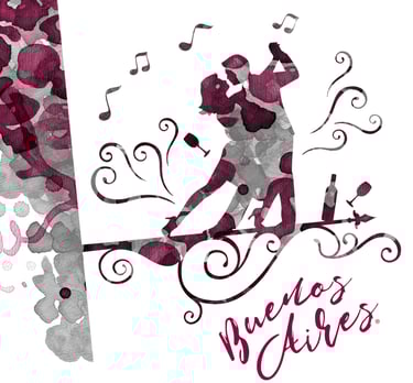
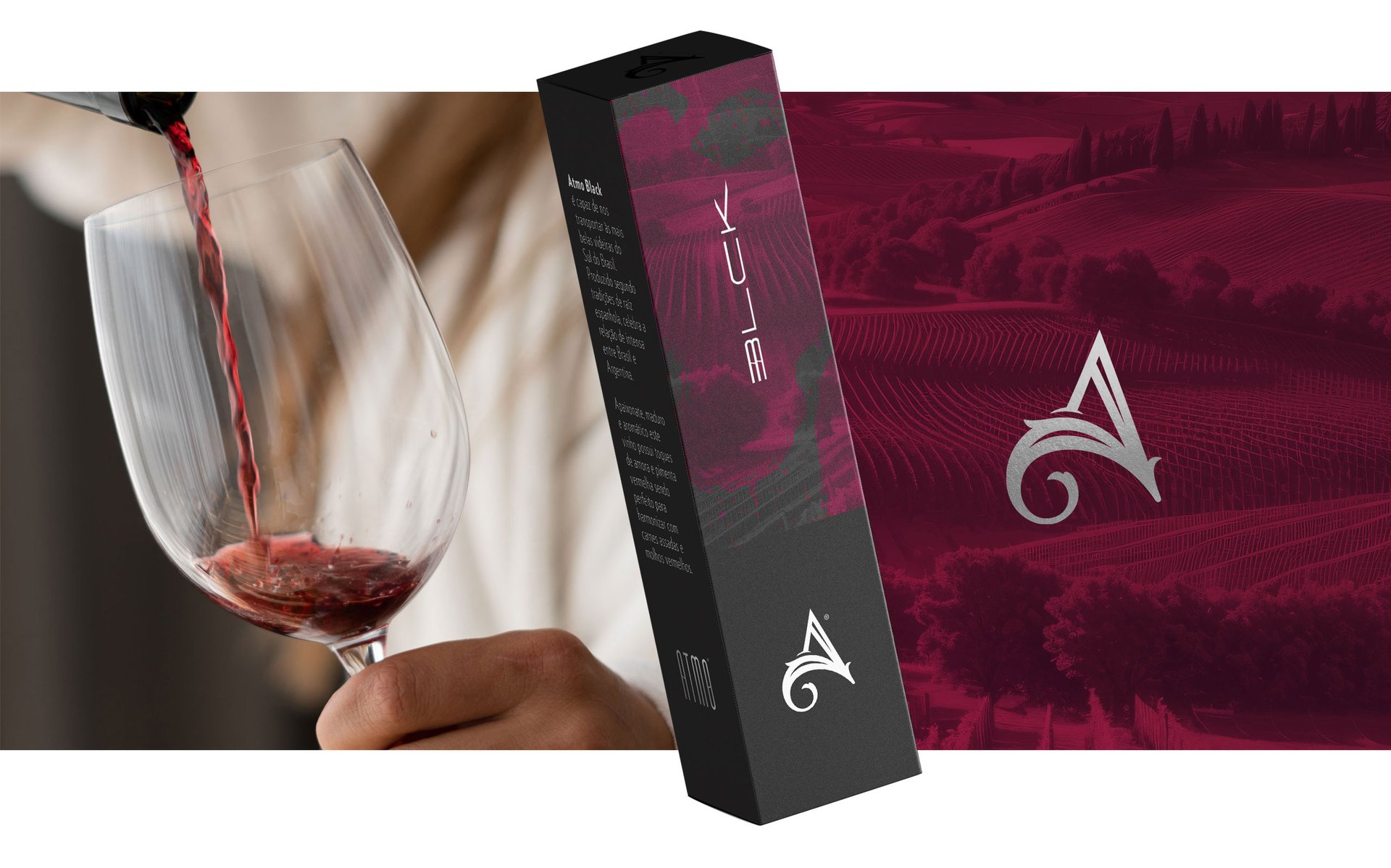
Original illustrations created in 2006 in an improvised manner with a letter opener and wine, but with a great deal of inspiration, enrich the graphics and incorporate an artisanal essence.


See also


Dr GUSTAVO MORI®
CBSJJPRO®
GOlem®


MTrek®