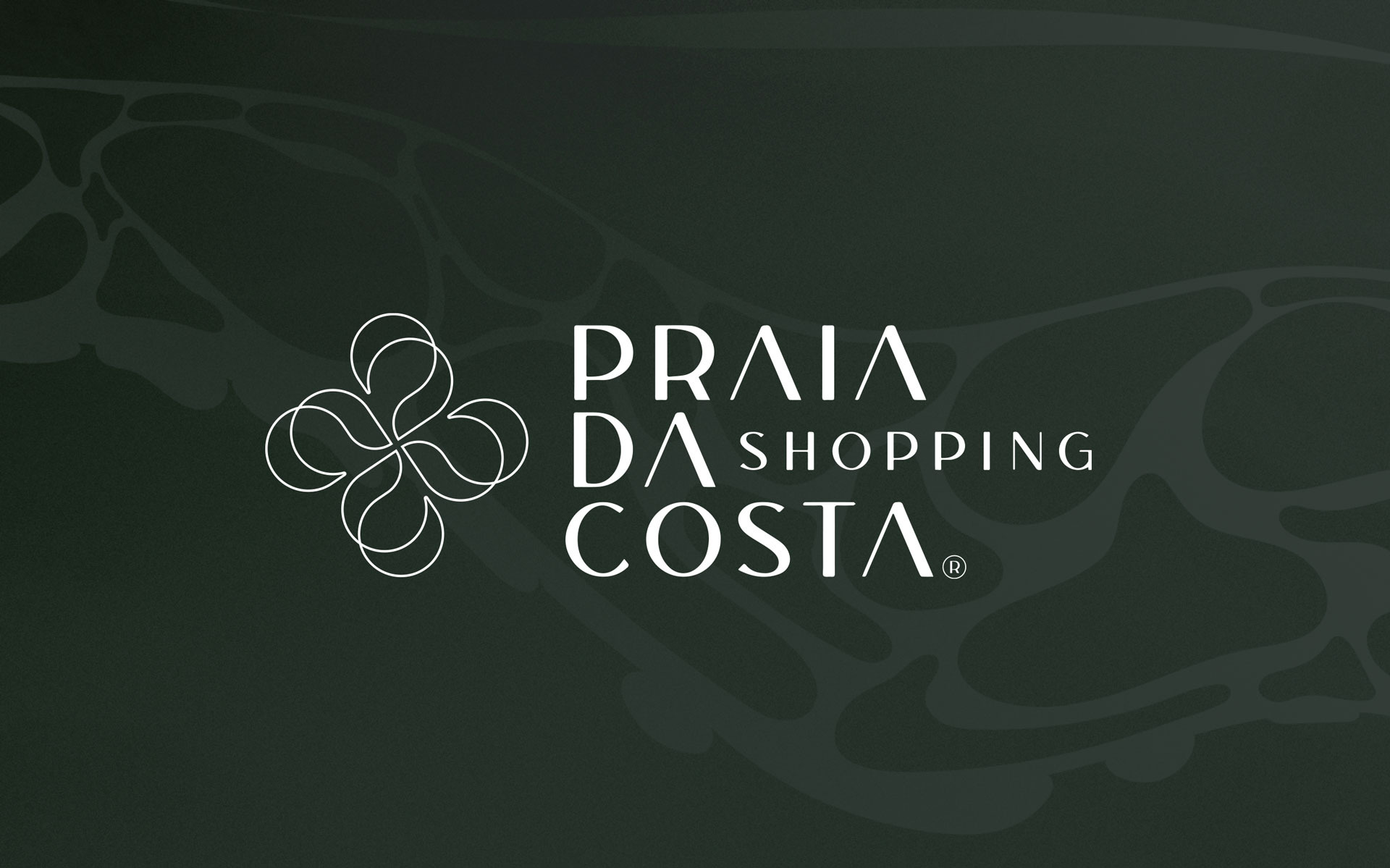


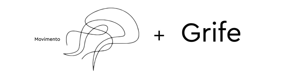
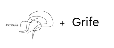
Praia da Costa Shopping®
Identidade criada para o Shopping Praia da Costa, que une marcas de luxo e espaço aconchegante no ponto mais nobre da cidade. A proposta foi encarada como uma revitalização da identidade do logo anterior reflexo do grupo Sá Cavalcante, um cata vento. Apoiados nesta premissa incorporamos inspiração direta ao movimento que o oceano pulsa.
O símbolo criado é uma releitura do antigo e incorpora elementos que são intrínsecos à marca.
Direção de Arte Beto Gozzo
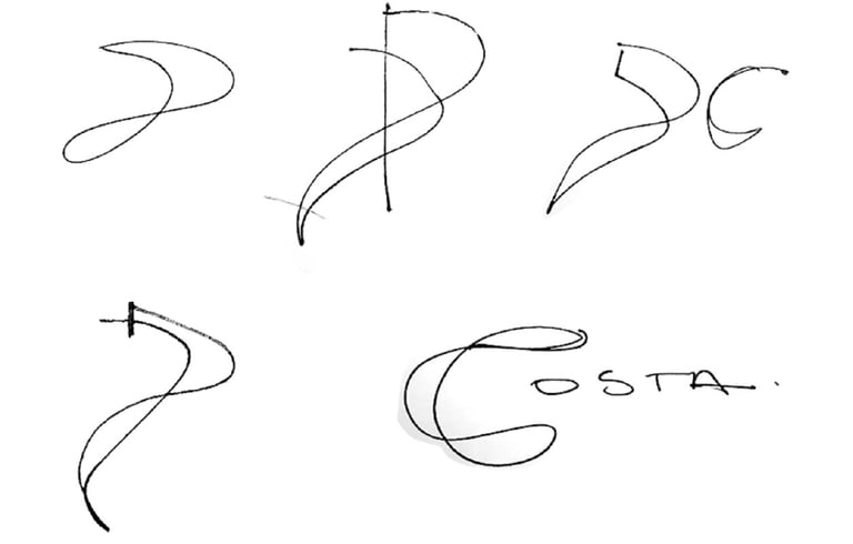
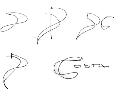
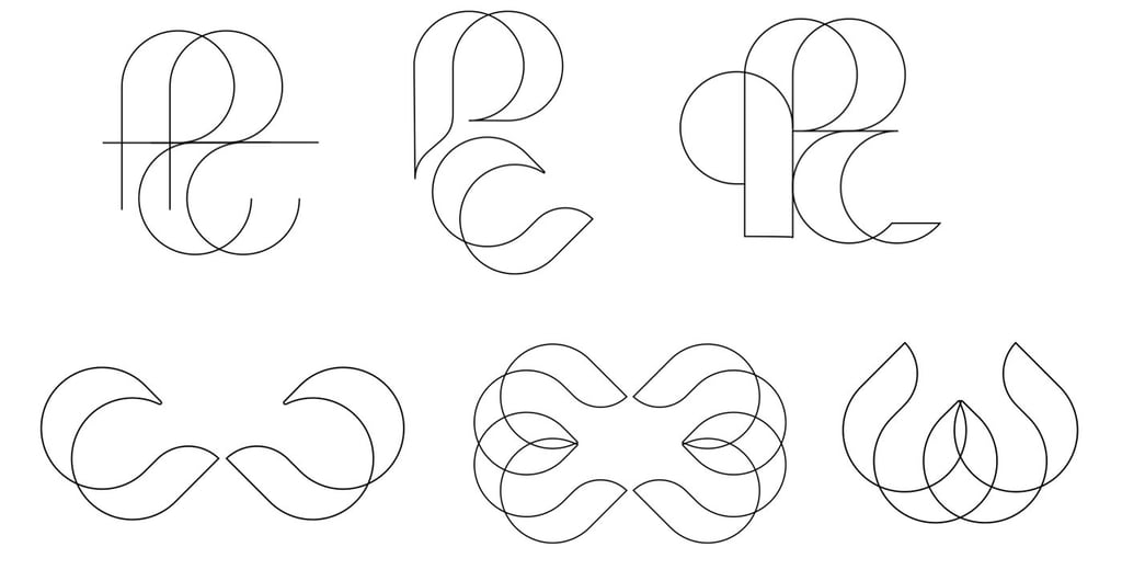
The lines are inspired by LIVING waters, suggesting transparency and fluid movement;
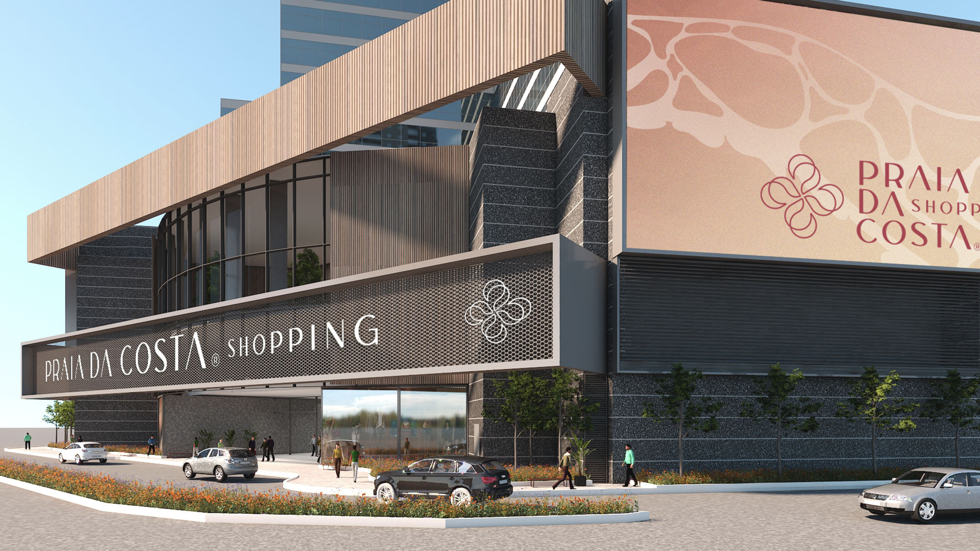
The symbol also functions as a seal and can be applied in various ways;
It subjectively suggests that the mall brings together a variety of activities;
The playful shape has emotional appeal and reflects a family-friendly atmosphere.
The organic symbol contrasts with the linear decorative finish;
The shape is derived from the letters P and C;
A shopping mall needs to be full of life, just as a heart needs to pump blood to the body, attracting people with activities focused on family and leisure.
WE CREATED A BRAND THAT SHOWS THAT THE MALL IS FULL OF LIFE, BRIMMING WITH ENERGY, AND CAPTIVATING FROM THE INSIDE OUT.