
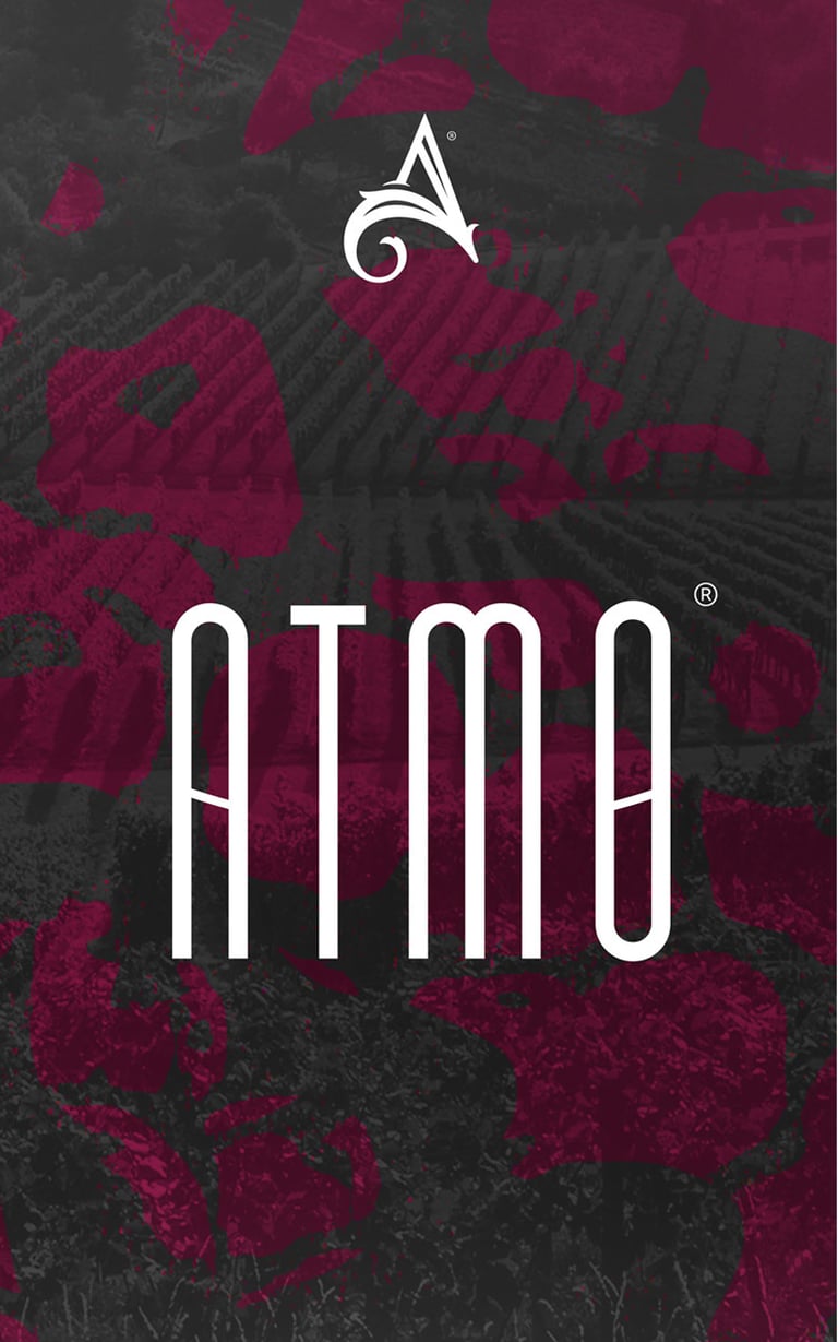
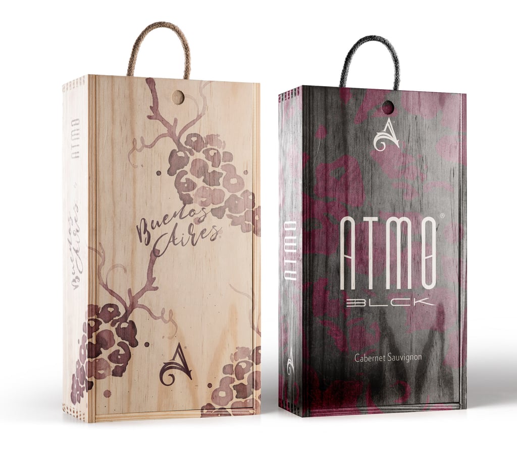
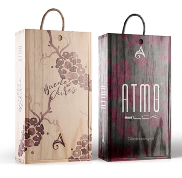
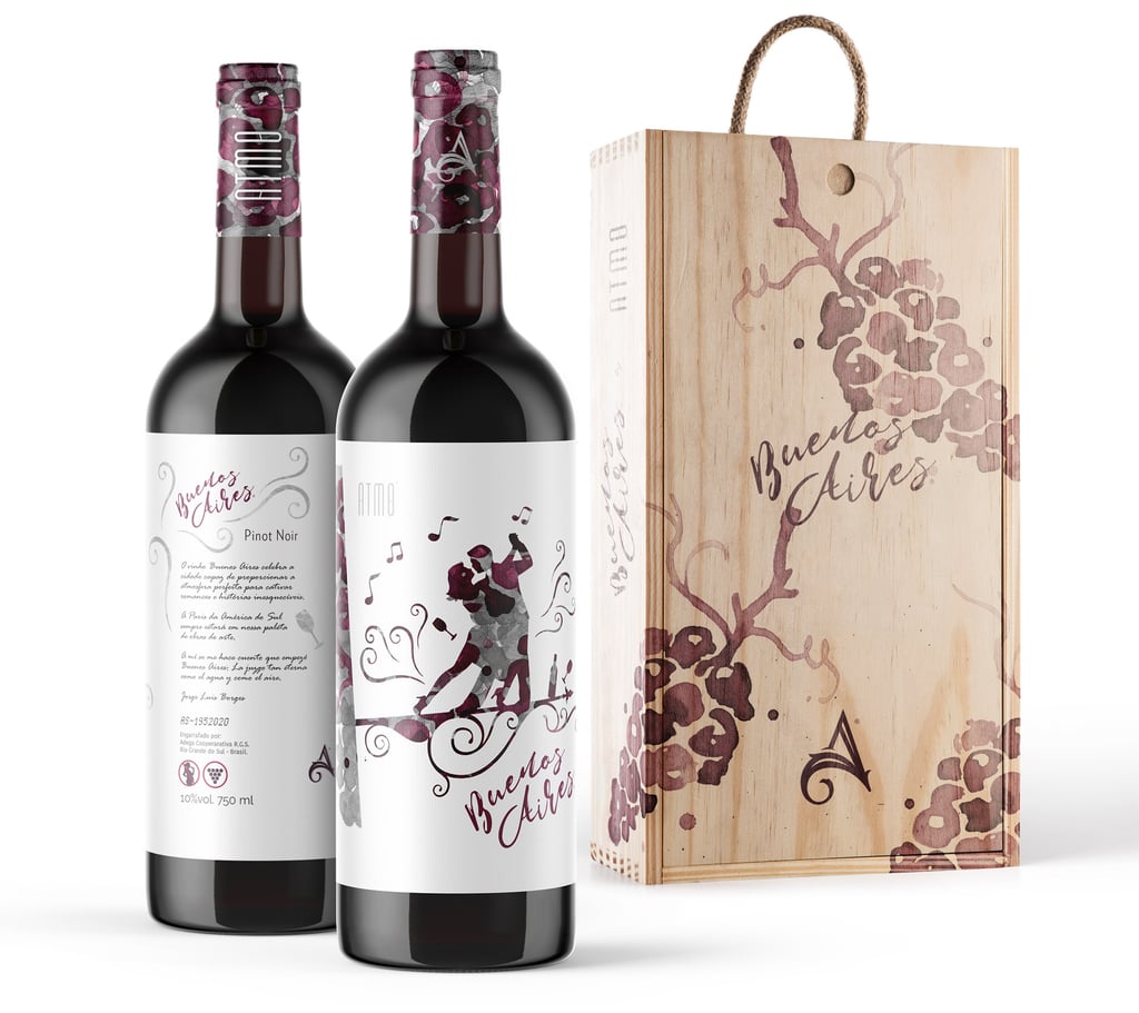
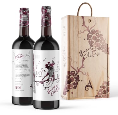
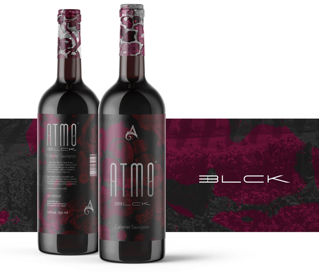
ATMO®
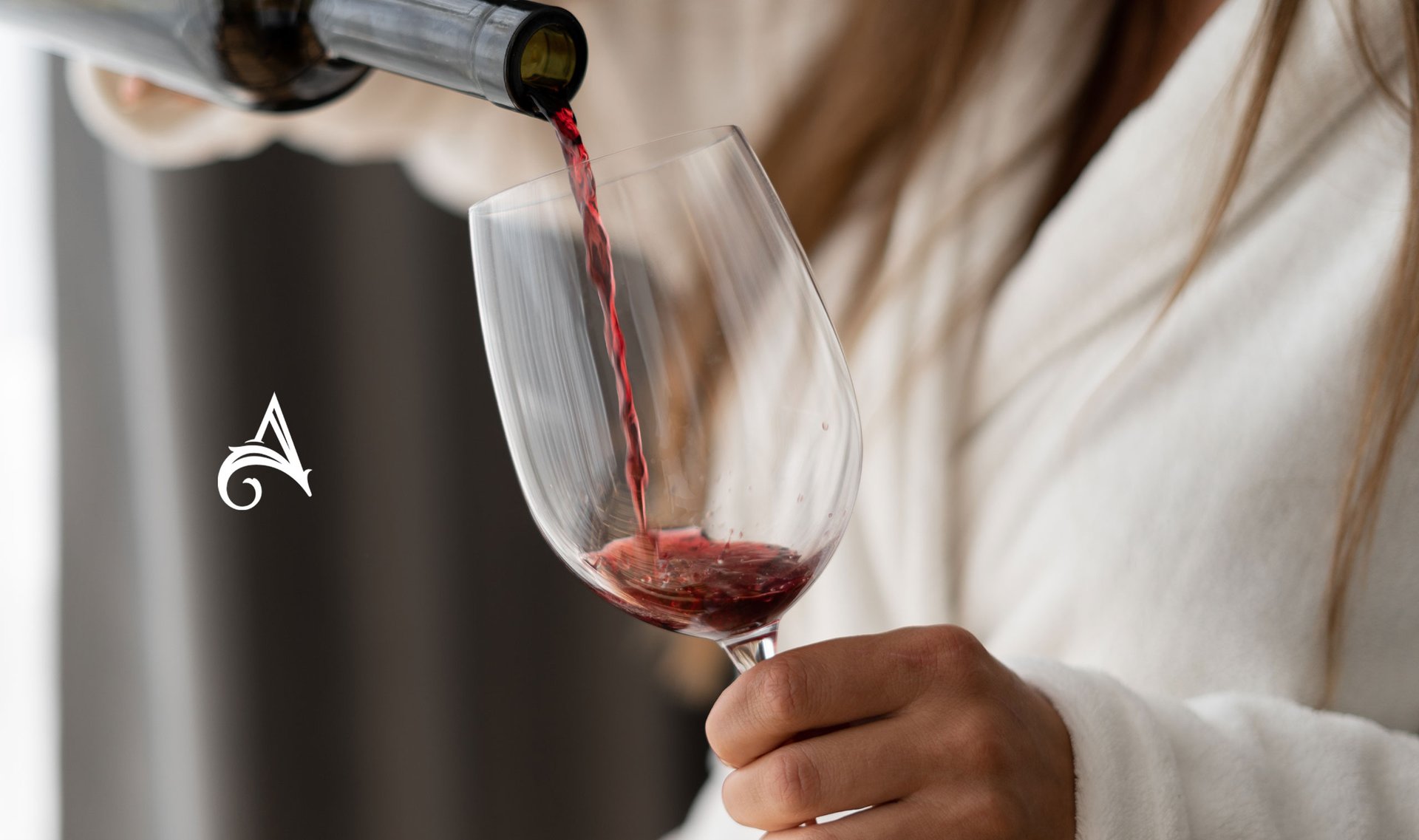
The concept developed for the brand explores the atmosphere created by drinking excellent wine. The symbol is a harmonious fusion of the organic shape reminiscent of the vine leaf and the outline of the grape. It symbolizes the beginning of the journey, where nature plays its vital role in the creation of heavenly nectar.
The ascending path of straight lines in the symbol symbolizes the careful application of refined technique from the cultivation of the grapes to the winemaking process. Each line represents a stage, a stage of improvement and dedication to the art of wine.
Art Direction Beto Gozzo
Illustrations Beto Gozzo

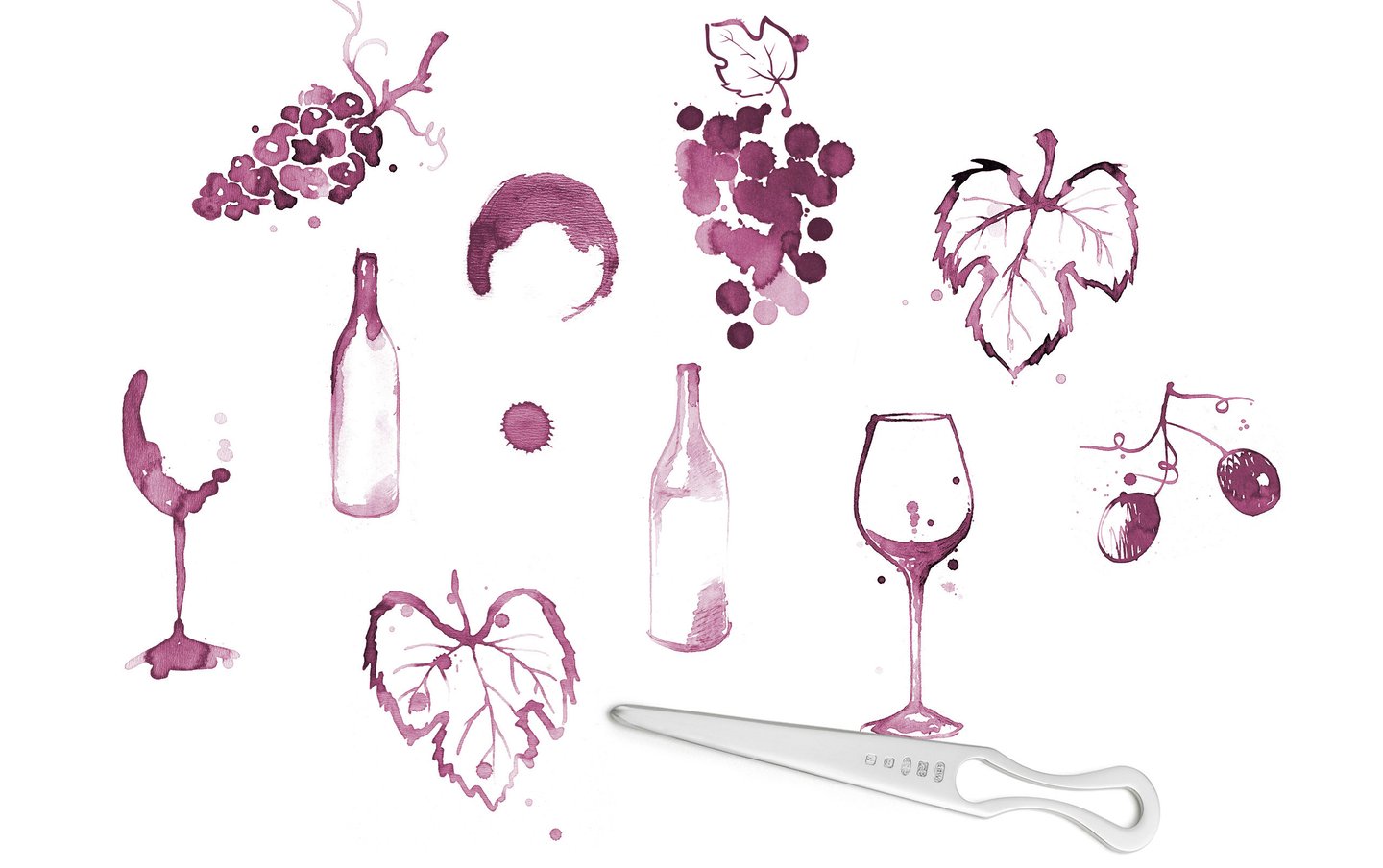
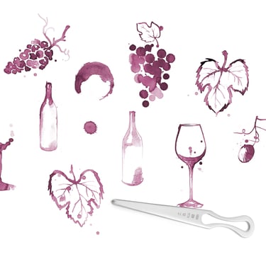
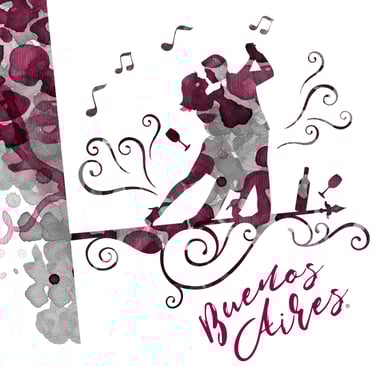
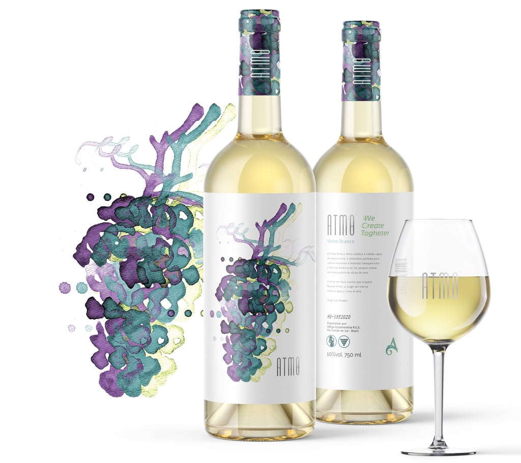
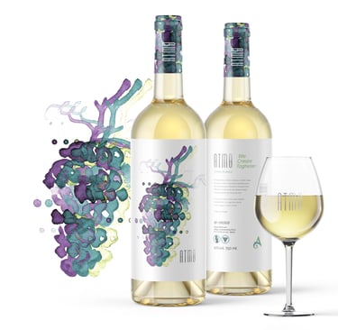
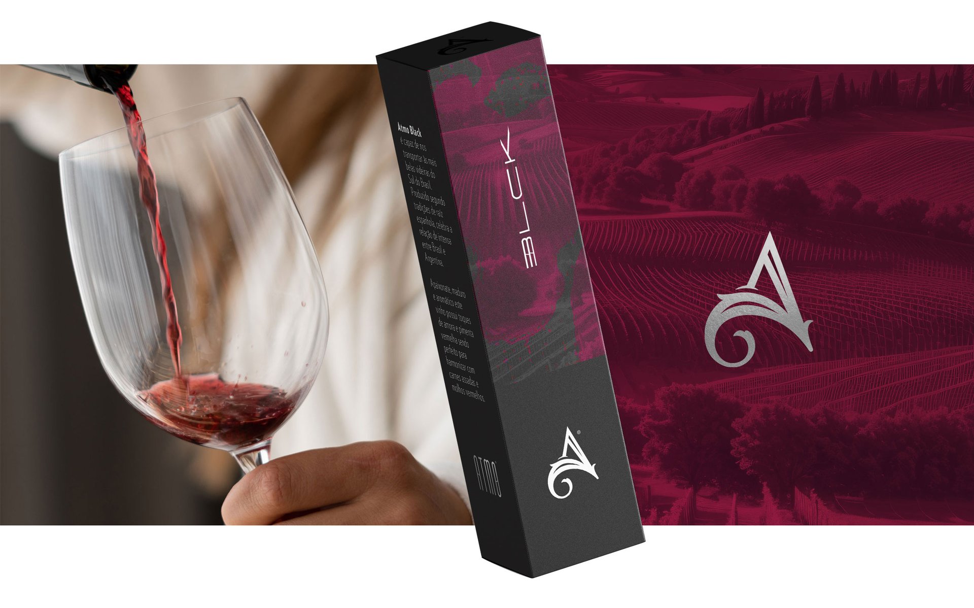
Original illustrations made in 2006, improvised with a letter opener and wine, but with a lot of inspiration, enrich the graphics and incorporate an artisanal essence.
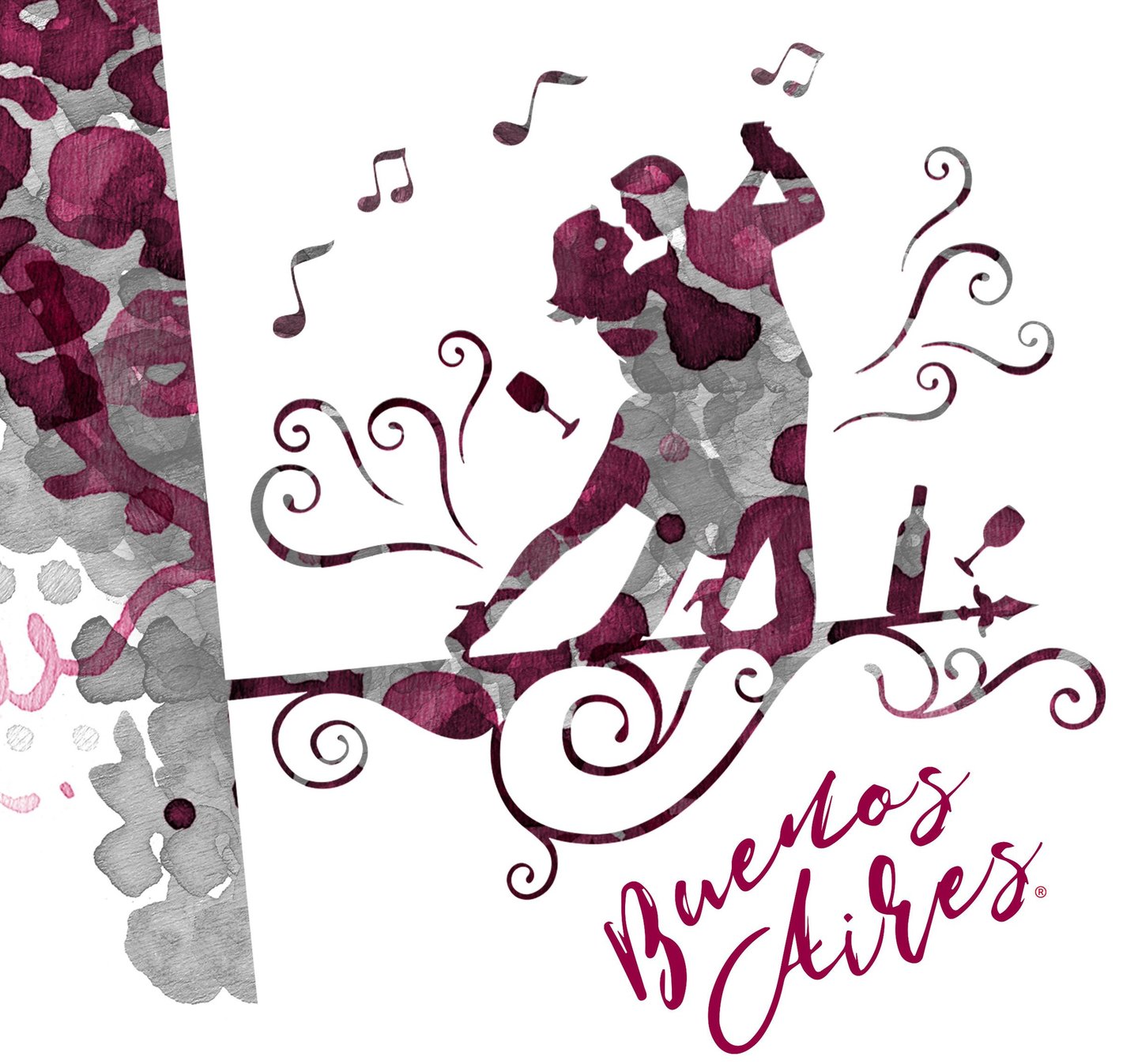


The brand's purpose is to be connected with the action and sports lovers.


AçaíNOW®
COPA BRASIL®
LIGGO®
Mtrek®
Check out also the cases

Contact
beto@livewisebrand.com+55 19 98379.8090 (Whatsapp)
Bunker
Frei Manoel da Ressurreição Street, 1256. Guanabara, Campinas - SP. CEP 13073-221
© 2024 LWB - LiveWiseBrand. All rights reserved.
